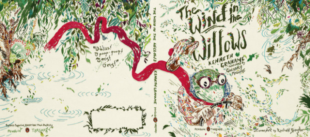
It’s a freebie week on Top Ten Tuesday (hosted by The Broke and the Bookish) – we’re free to pick any topic our little hearts desire. Since I just start participating in TTT, I decided to look back through the old topics and select one I wanted to do. I love book cover design, so I… Continue reading Top Ten Favorite Book Covers
Category: book design
New Anne of Green Gables series editions!
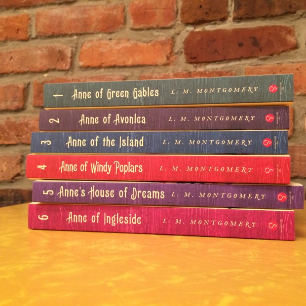
I’ve long lamented the fact that L.M Montgomery’s novels haven’t been treated to the trend of reissuing classic books in gorgeous new covers. The only in-print editions available for most of the books in the series are the mass paperbacks from Bantam, which are small and boring. Below are two editions of Anne of the… Continue reading New Anne of Green Gables series editions!
Paperback vs. Hardcover Covers
I have been wanting to read the novel Netherland by Joseph O’Neill for a while, and I was excited that the paperback release date is being move up from June, to tomorrow (due in large part to the popularity Barack Obama brought to the novel when he mentioned in an interview that he was reading… Continue reading Paperback vs. Hardcover Covers
Olive Editions
Everything Is Illuminated: A Novel Jonathan Safran Foer Harper Collins is releasing new “Olive Editions” of three popular novels. They are super cute editions, and the best part is they are priced very affordably too. The list price is $10, and Amazon is selling them for $8. The first three Olive Edition titles are Everything… Continue reading Olive Editions
Moral Disorder – Cover Designs
Moraldisorder Here’s an example of a vast improvement of cover design from the hardcover to softcover release. I don’t hate the hardcover design; it’s unusual and definitely stands out at the bookstore. And I think the design style somewhat fits her style of writing. (In general, I haven’t read this specific collection of short stories… Continue reading Moral Disorder – Cover Designs
Book Design: Half of a Yellow Sun
I’ve been wanting to read Half of a Yellow Sun by Chimamanda Ngozi Adichie for many months. Almost immediately after it was published I started seeing all sorts of rave reviews, from a variety of reputable sources. It also won the Orange Prize for Fiction. That’s why I was very startled in Barnes and Noble… Continue reading Book Design: Half of a Yellow Sun